By Abdul Nassiq
Minimalism; is a design movement characterized by extreme spareness and simplicity. Considering the definition of the word, it’s ironic how it seems to be everywhere right now, and personally, I can see the appeal.

Whilst studying architecture for a few years, a habit that I noticed for myself, especially when designing, is that I’ve tended to overthink, albeit for better or for worse. One way for me to overcome this is by slowly adopting the idea of minimalism as a way to not complicate things (and get it done).
After beginning to study in this course, building designs that I tend to gravitate towards to are neat, simple, calming yet efficient/functional without compromising on their aesthetics. Under deeper investigation, this is usually done in a way where the design prioritized more on the function rather than ornaments, function over form.

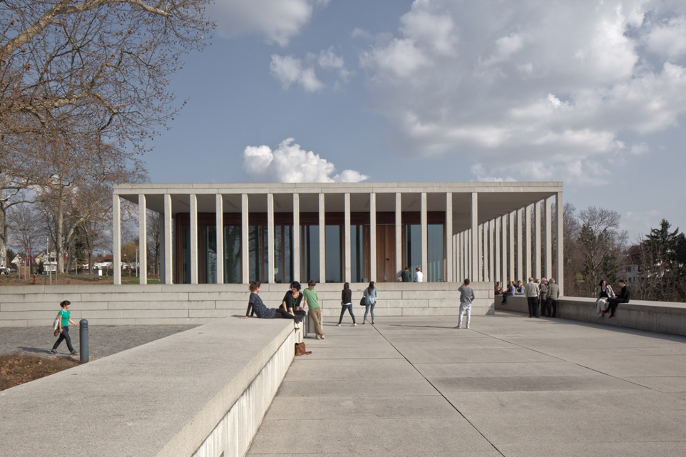
Museum of Modern Literature by David Chipperfield Architects
Before going deeper into this subject,
A brief history of how minimalism was conceptualized, early signs of this movement go back to the 1920s during the industrial revolution. With this era’s new lifestyle, materials, and construction methods, building design no longer resembles classical aesthetics. Design movements such as De Stijl, Russian Constructivism, and Bauhaus contributed to this style by those who emphasize pure functionality and rejected excessive ornamentation. This is done with simple abstracts, geometric shapes, straight lines, and primary colors.
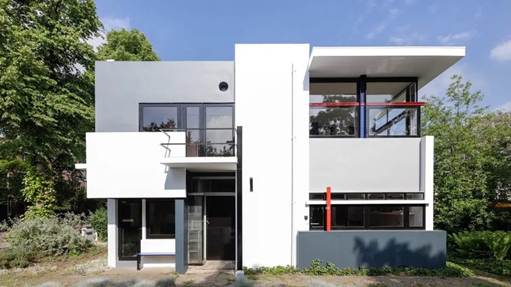
Examples of architectural movements that inspired minimalism;

De Stijl, Rietveld Schröder House

Russian Constructivism, Narkomfin Building

Bauhaus, Bauhaus Masters’ House
The saying goes;
"Less is More" & "Less, but Better"
A design principle commonly associated with this subject is usually ‘less is more’ popularized by architect Ludwig Mies van der Rohe, but another term I want to highlight is ‘less but better’ by industrial designer and architect Dieter Rams. He developed a set of principles called “The 10 principles of good design”, while it may or may not be intentional these perfectly align with the ideology of minimalism;
1. Good design is innovative
2. Good design makes a product useful
3. Good design is aesthetic
4. Good design makes a product understandable
5. Good design is unobtrusive
6. Good design is honest
7. Good design is long-lasting
8. Good design is thorough down to the last detail
9. Good design is environmentally-friendly
10. Good design is as little design as possible

Many people share a similar appreciation for this style of design, yet many others see it as simply plain or lazy. Despite this, the previous sets of principles showcased a huge sophistication, thoughts, and amount of detail when it comes to minimalism. It may look simple but there is a degree of complexity in order to achieve a design that’s minimal but also efficient.
What does minimalism mean to me whilst studying architecture?

Like many of us studying architecture, some of the benefits of this course is the small amount of test and exams we had to take, the caveat being the heavy workloads. Because of how I felt overwhelmed by this, I started to gather clutter, both physically (in my workspace) and mentally (overthinking unnecessarily), resulting in little to no work actually being done (AKA procrastination), which resulted in me losing a bit interest in architecture from this fatigue. After going through this destructive habit multiple times, a change of pace is needed, this is where using minimalism as a strategy comes in.
Learning about minimalism and applying this ethos to my workflow, personally helped me be more interested and gain a deeper appreciation towards architecture and design as a whole. It made it easier for me to digest and manage, hence I started to apply this idea of efficiency to everything.

Princessehof Museum's Tearoom

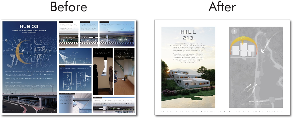
Early on when studying architecture, I had this perception that design needs to be ostentatious, complicated, and excessive, while may not be necessarily wrong, this approach wasn’t for me. Attempts of this ended up being too complicated for me to understand and even present it to others. With minimalism, I was able to design projects in a way where the concept and function were clear enough for it to be effective. Not just in the design of the buildings, but also in how I present them through my banners & slides.
The knowledge I’ve gained (especially when tasked to write this by Archlabs), enhanced my understanding of the amount of work and effort in order to achieve that type of aesthetic. My own work, while admittedly still overthink sometimes, has helped to improve on how I approach my own design and develop a clearer narrative, for it to be understandable for myself and hopefully present it that way to others.
While I attribute most of my work to minimalism now, by no means do I consider myself to fully integrate it yet to my routine, this by itself is something that I’m still learning. To bring this to an end, I would like to conclude this by showcasing how I adjust my work ‘minimally’;

Comments